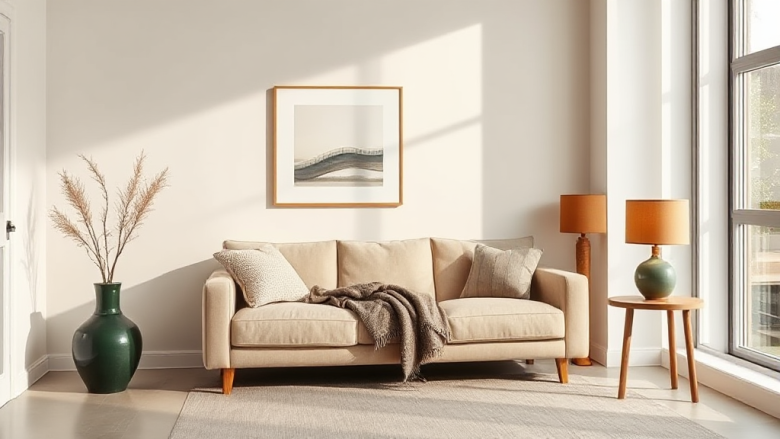
The single rule that separates an expensive-looking room or outfit from a cheap one isn’t the price tag. It’s restraint. Luxury whispers. It doesn’t shout with twelve colours, five competing textures and a shelf crammed with objects. If you want to know how to get a luxury look for less, start by removing things rather than adding them. Strip a room back to three colours. Pare an outfit down to two textures. The moment you limit what’s on show, everything that remains starts to look deliberate, and deliberate reads as expensive.
That’s the principle behind every swap in this guide. We’re not chasing brands or faking wealth. We’re borrowing the visual grammar that high-end interiors and well-dressed people use instinctively: fewer pieces, better proportion, honest materials and a calm palette. None of it requires a big budget. It requires editing.
Why Restraint Reads as Expensive
Think about the last hotel lobby that made you stop. It probably had a limited palette, maybe two neutrals and one accent. The furniture was spaced so each piece had room to breathe. There was texture, but it came from a few large surfaces rather than dozens of small ones. That’s it. That’s the whole trick, and it costs nothing to copy. Clutter is the fastest way to make a space look budget. A shelf with fifteen small ornaments reads as a car boot sale, no matter what those ornaments cost. The same shelf with three objects, one tall, one low, one textured, reads as styled. The eye needs somewhere to rest. Give it that, and the brain fills in the word “expensive” without being asked.
The same logic applies to what you wear. A plain fine-knit jumper in a single neutral shade looks more considered than a printed top with ruffles, hardware and three colours competing. High-end fashion houses build entire collections on this idea. So can you, using what’s already in your wardrobe.
Colour, Texture and Quantity: The Three Levers
Every expensive-looking space or outfit is controlled along three levers. Pull them deliberately and you’ll get the look. Leave them to chance and you’ll get the opposite.
Colour: Pick Three and Stop
Choose a base, a secondary and one accent. That’s your whole palette. In a living room, that might be warm white walls, oatmeal upholstery and a single deep green cushion or ceramic. In an outfit, it could be charcoal, cream and a hint of camel. Once you’ve set the three, resist the urge to add a fourth just because you like it. The restriction is the point.
Warm neutrals tend to read richer than cool greys, especially in British light. A soft off-white, a mushroom, a muted taupe, a deep olive. These shades flatter skin tones and wood alike. If you’re not sure where to start, hold a paint swatch next to your largest piece of furniture or your favourite coat and let that piece choose the family.
Texture: Fewer Surfaces, Bigger Impact
Luxury lives in touch. A room with one chunky wool throw, one linen curtain and one aged wooden surface feels richer than a room with ten small patterned items. Choose three textures and repeat them. Rough, smooth and soft is a reliable trio. Linen, stone and wool. Leather, glass and velvet. When the same textures echo around a space, it feels intentional rather than accidental.
For clothing, texture does the heavy lifting that logos used to. A brushed cotton shirt, a fine merino knit, a pair of suede loafers. These materials catch light differently from polyester and immediately lift a simple outfit. You don’t need many of them. Two or three well-chosen textured pieces will carry an entire capsule.
Quantity: Edit, Then Edit Again
Before you buy anything, take one thing away. Remove the small clutter from the mantelpiece. Take off the third bracelet. Clear the kitchen worktop down to one useful object and one beautiful one. The gap you create is what makes the remaining items look chosen rather than accumulated.
This is the hardest lever for most people, because removing feels like losing. It isn’t. It’s the difference between a display and a collection. A display has a point of view. A collection just has volume.
Specific Swaps That Cost Little but Look Like a Lot
Principles are useful, but you probably want to know what to actually change. Here are the swaps that give the biggest visual return for the smallest spend.
Swap plastic coat hangers for matching wooden or slim velvet ones. This is the cheapest luxury trick there is. A wardrobe of identical hangers makes even a rail of high-street clothes look like a boutique rail. It also stops shoulders losing their shape, which keeps garments looking newer for longer.
Swap a patterned duvet cover for white linen or crisp cotton. White bedding is what hotels use because it reads clean and calm, and it makes any bedroom look more expensive instantly. A plain white set with a textured throw at the foot of the bed beats a busy print every time. If all-white feels stark, layer in one warm neutral blanket.
Swap small framed prints for one larger piece. A gallery wall of nine small frames can look busy and cheap. One large, simply framed print or a single well-stretched canvas commands the wall and immediately raises the tone. If you already own small prints, group them tightly in a grid rather than scattering them.
Swap overhead lighting for layered lamps. Nothing flattens a room like a single bright ceiling light. Two or three low lamps at different heights create pools of warm light, which is exactly how high-end interiors are lit. Use warm bulbs around 2700K. The change costs a fraction of new furniture and transforms the whole room after dark.
Swap visible clutter for closed storage. Baskets with lids, a lidded ottoman, a simple box on the shelf. If you can’t see it, it can’t cheapen the look. This one move tidies a room without requiring you to throw anything away.
Swap novelty accessories for one considered piece. Instead of three costume jewellery items, wear one. Instead of five scented candles, own one good one in a plain vessel. Instead of a busy phone case, choose a plain leather or matte one. Fewer, better, plainer.
Sourcing the Look Without the Price Tag
Once you know what you’re looking for, the sourcing becomes easy, because you’re no longer browsing. You’re hunting for specific things: warm neutrals, natural textures, simple shapes, generous scale.
Charity shops in affluent areas are goldmines for exactly this. People donate good-quality plain items because they’re not trendy, which is precisely why they look expensive. Look for solid wood furniture, linen curtains, wool blankets, leather bags and plain glassware. Check the seams, the weight and the hardware. Heavy, well-finished pieces are worth restoring. A tin of wood wax and a new set of handles can turn a tired chest of drawers into something that looks bespoke.
Online marketplaces reward patience. Search for the material rather than the brand: “wool throw”, “linen shirt”, “solid oak side table”. Set a saved search and wait. The right piece at the right price always turns up eventually, and waiting stops you buying filler that you’ll want to replace.
For anything new, buy the plainest version you can find. Plain ceramics, plain frames, plain cushion covers, plain knitwear. Then spend your money on the things you touch and look at most: your bedding, your sofa, your coat, your shoes. Those are the items where quality shows, and where a little extra spend genuinely changes how the whole look reads.
Scale matters more than you’d think. A slightly oversized lamp, a slightly larger rug, a slightly longer curtain that just kisses the floor. These small adjustments in proportion make a room feel designed rather than assembled, and they cost nothing extra if you get them right the first time.
Finally, keep a running list of what you actually need. Luxury looks effortless because nothing in it is random. When you shop from a list instead of a mood, you stop accumulating and start curating. That shift, more than any purchase, is how to get a luxury look for less. The restraint does the work. The budget just gets to stay intact.